Concept project

Bookella

Online Marketplace for Second-Hand Books

UX UI • Web • Mobile APP 

Project Statement

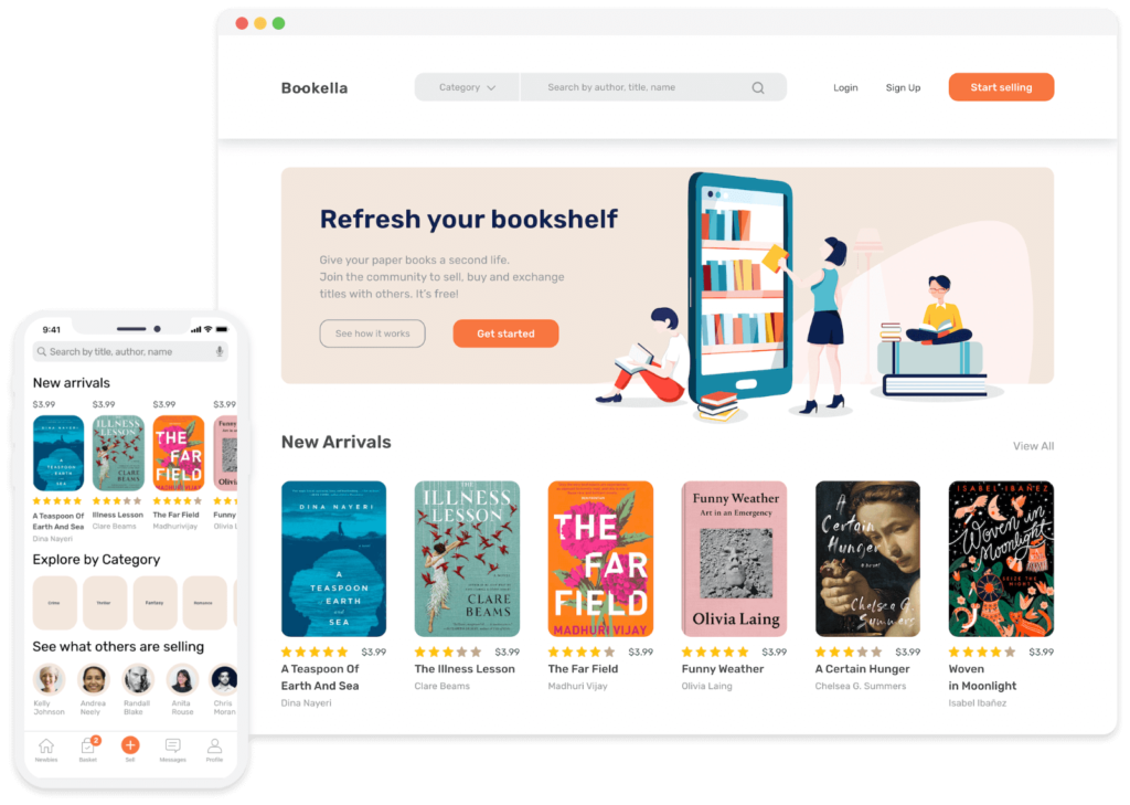
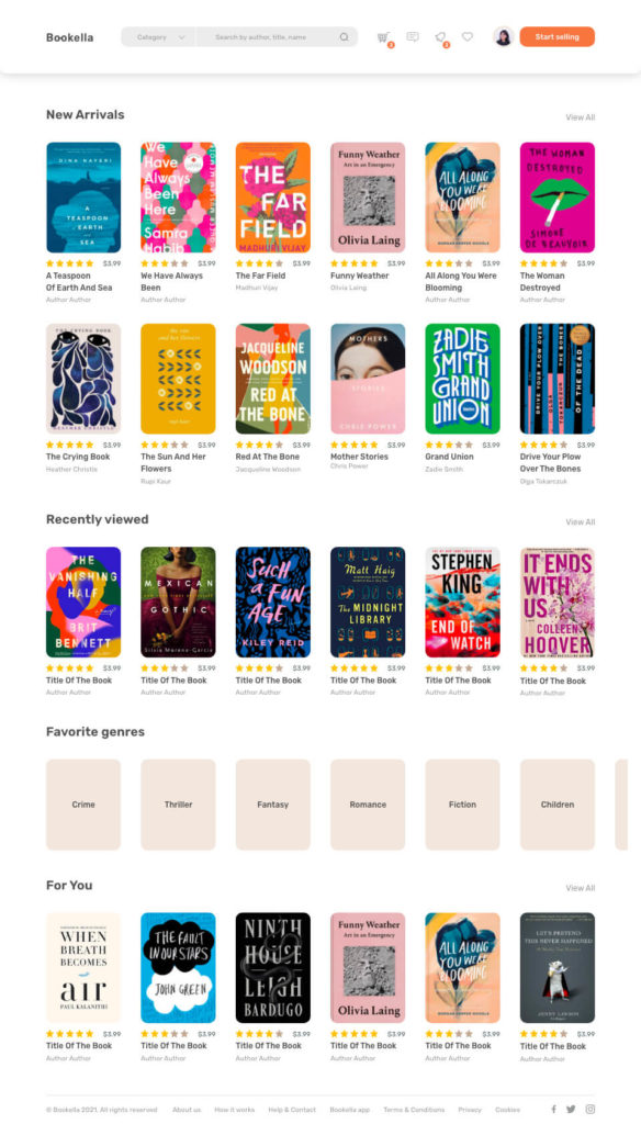
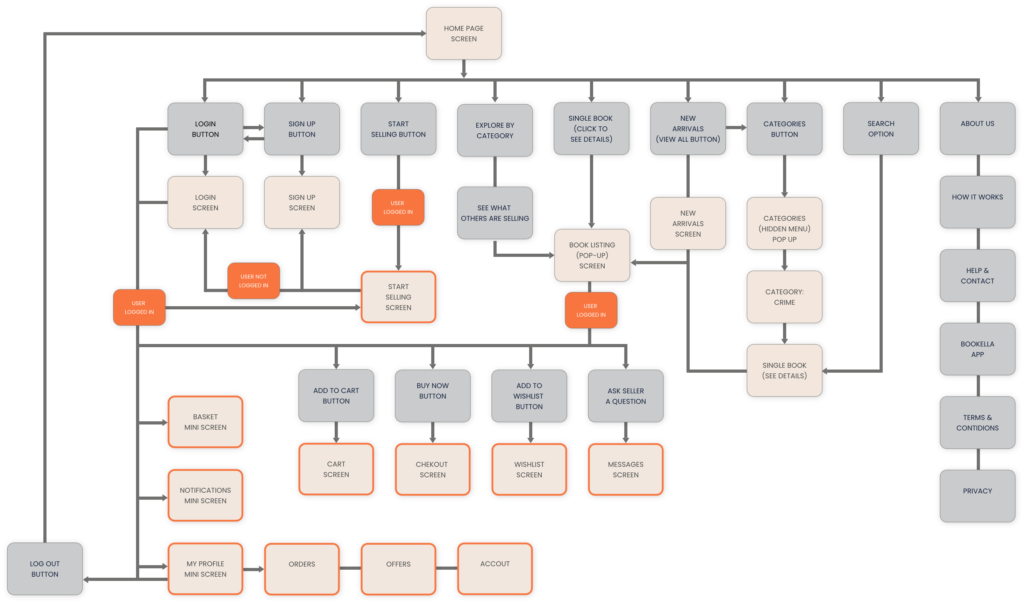
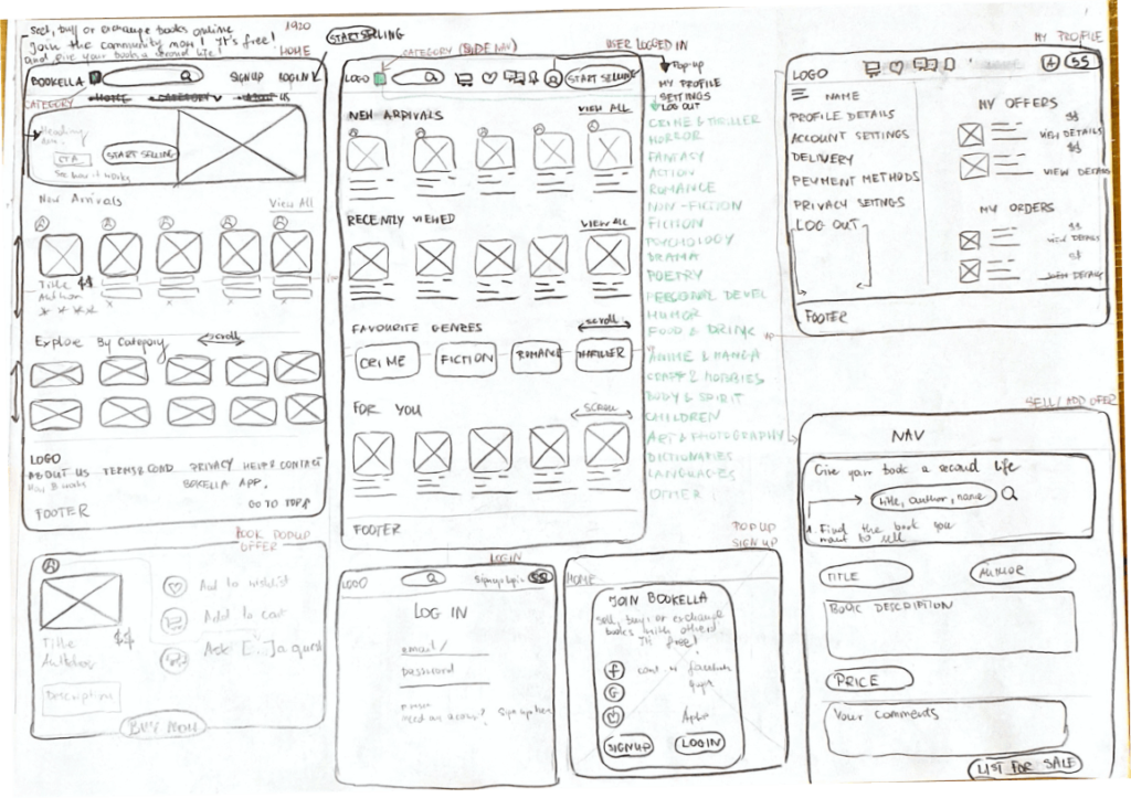
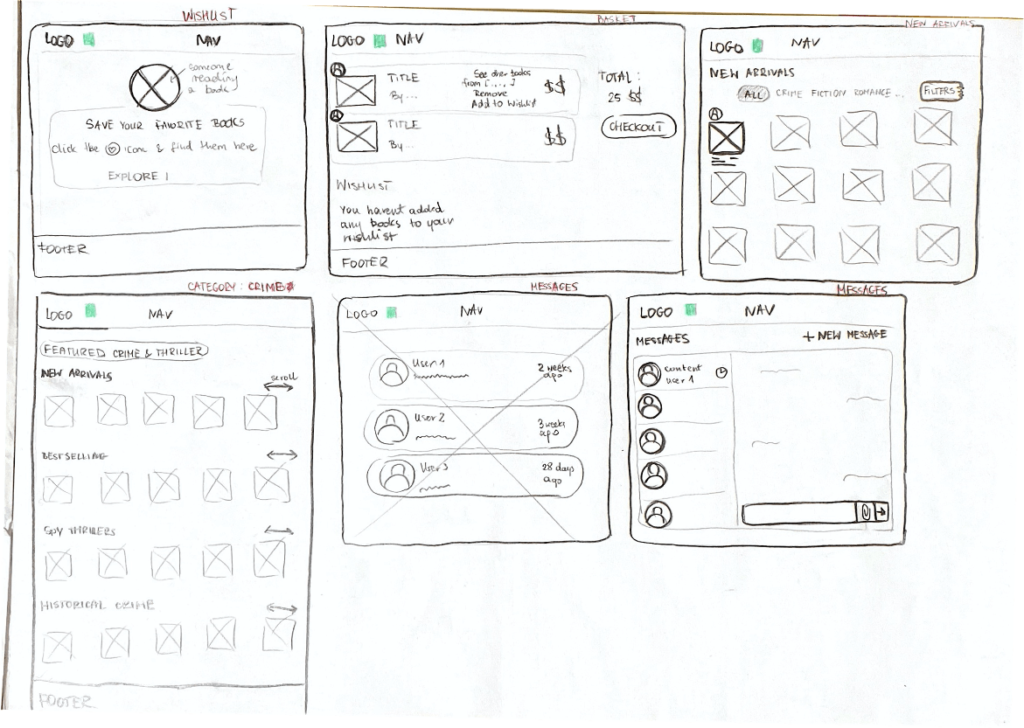
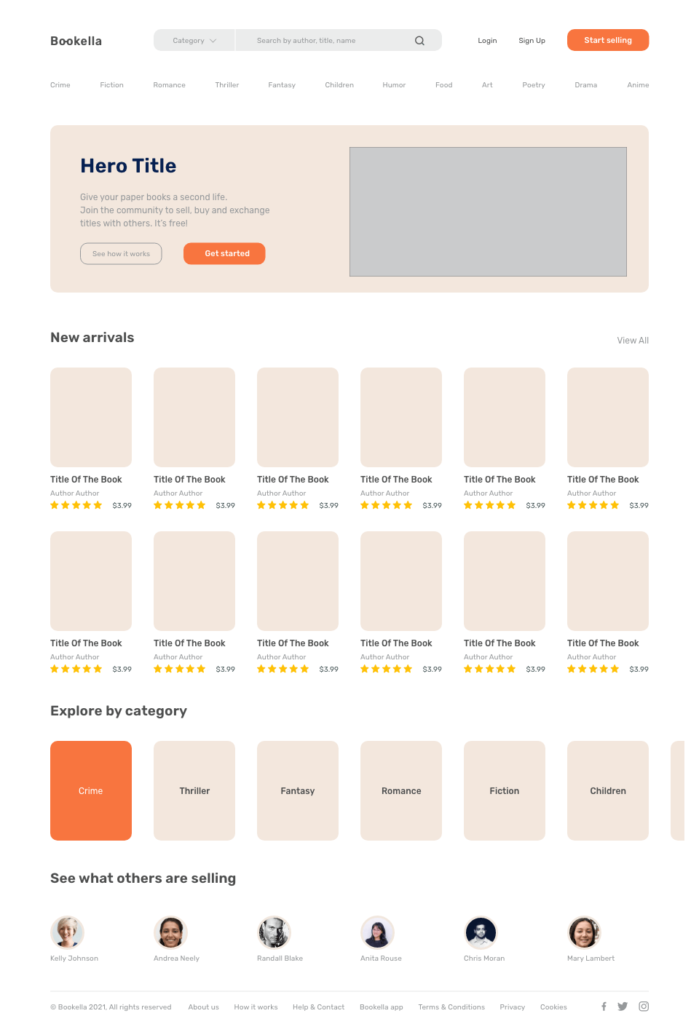
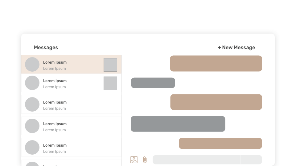
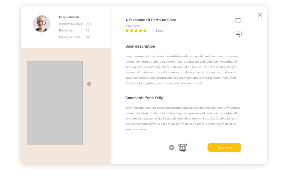
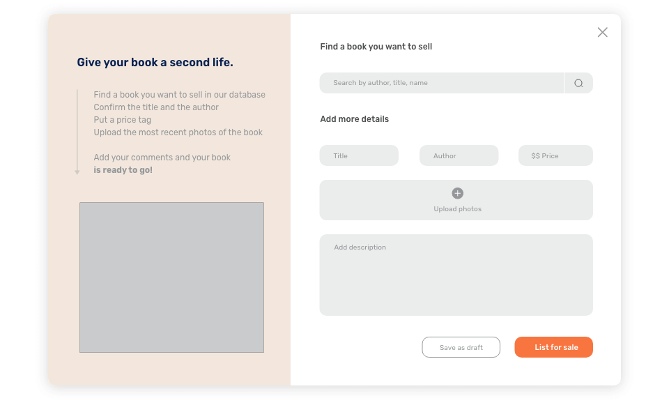
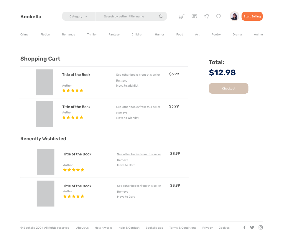
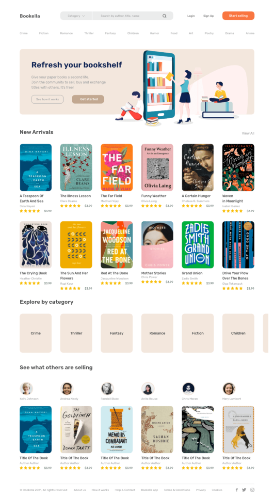
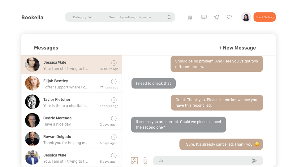
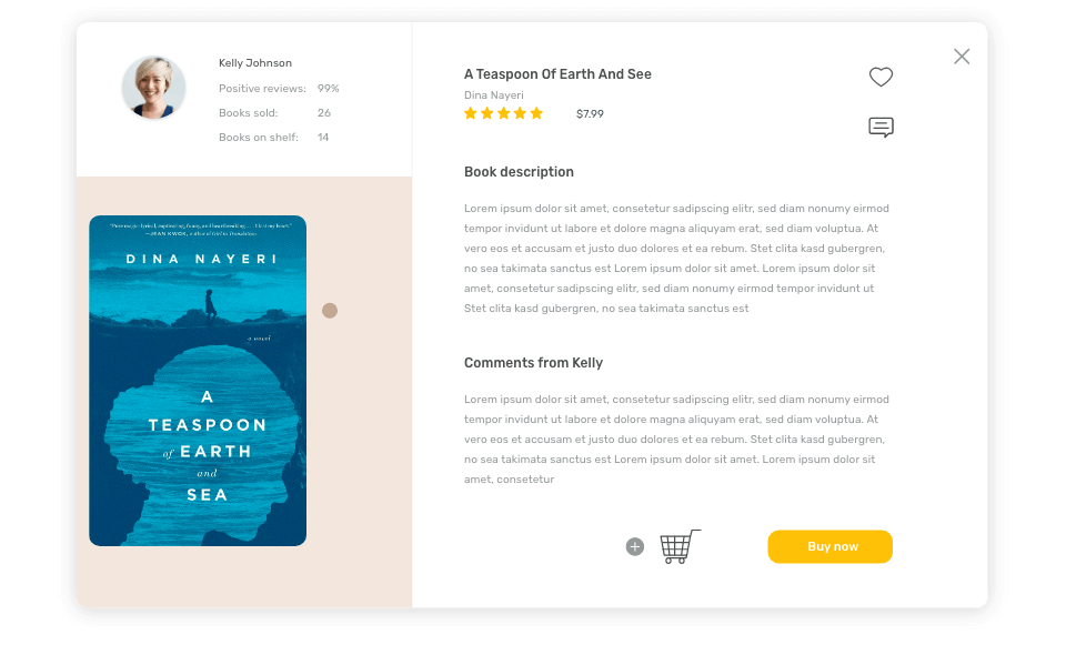
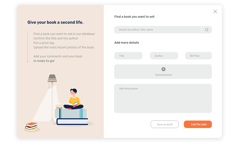
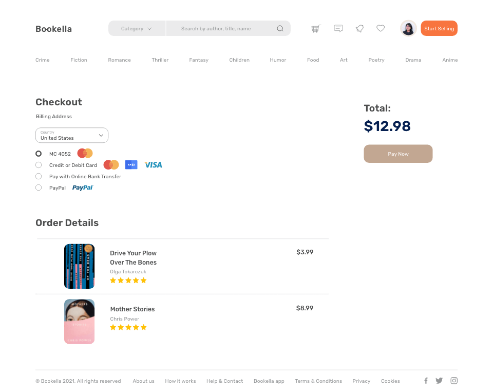
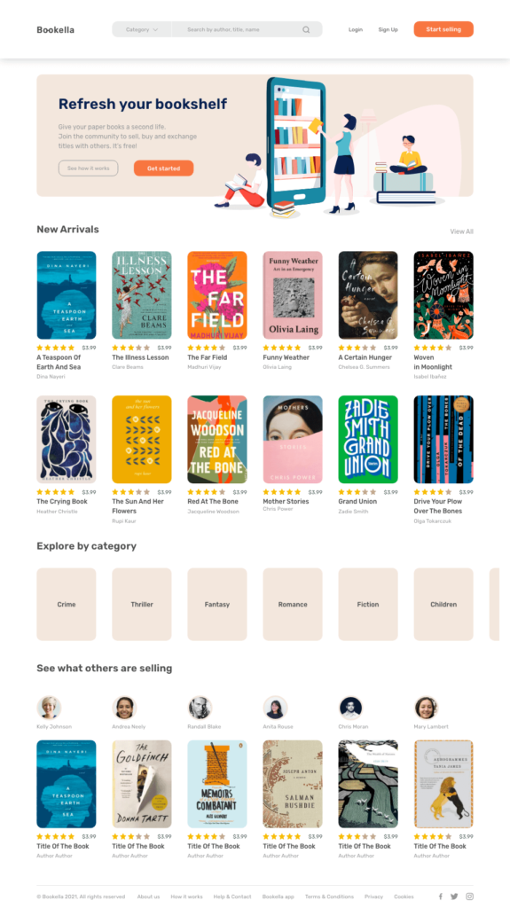
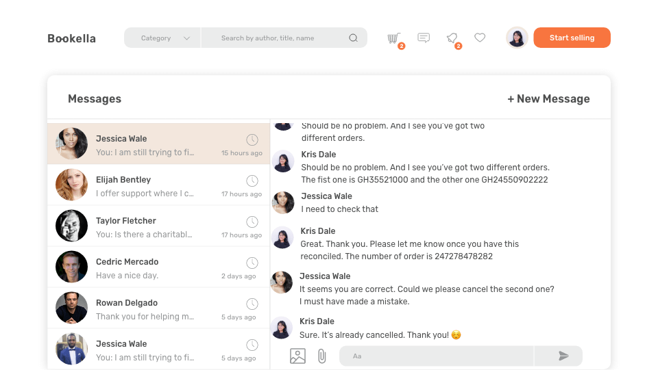
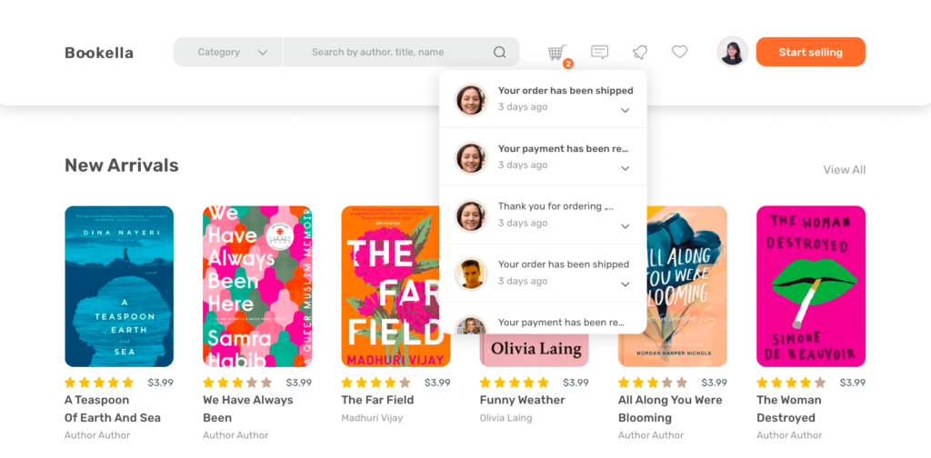
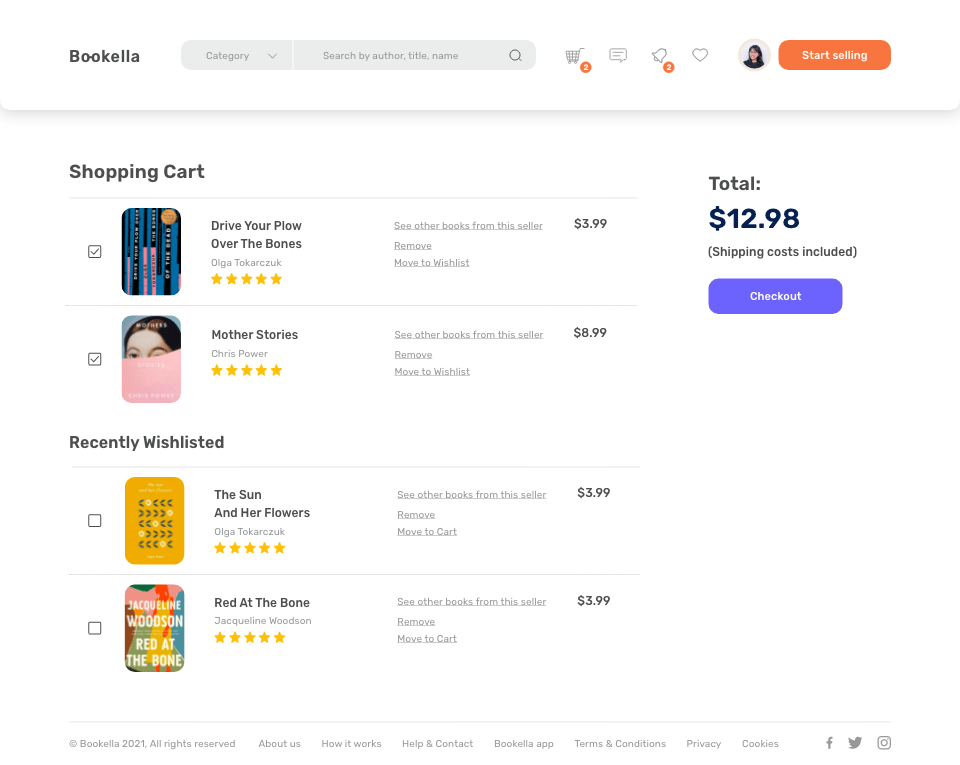
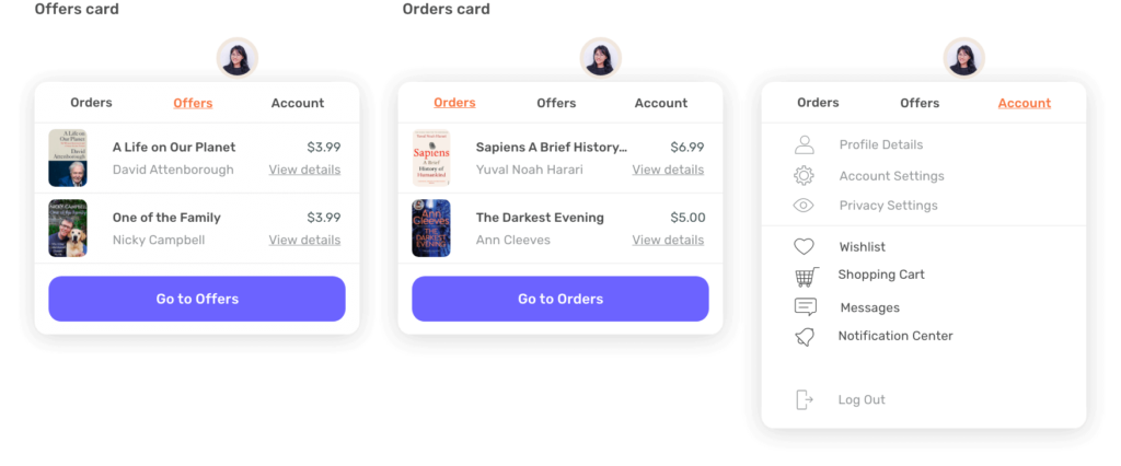
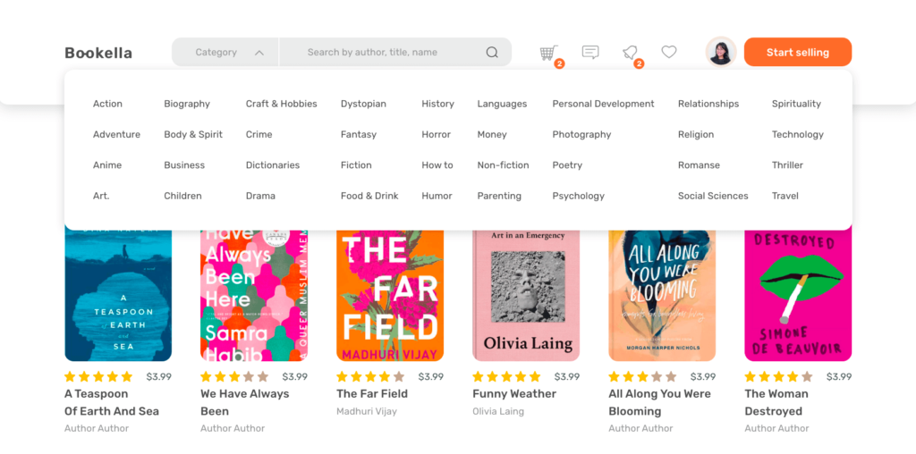
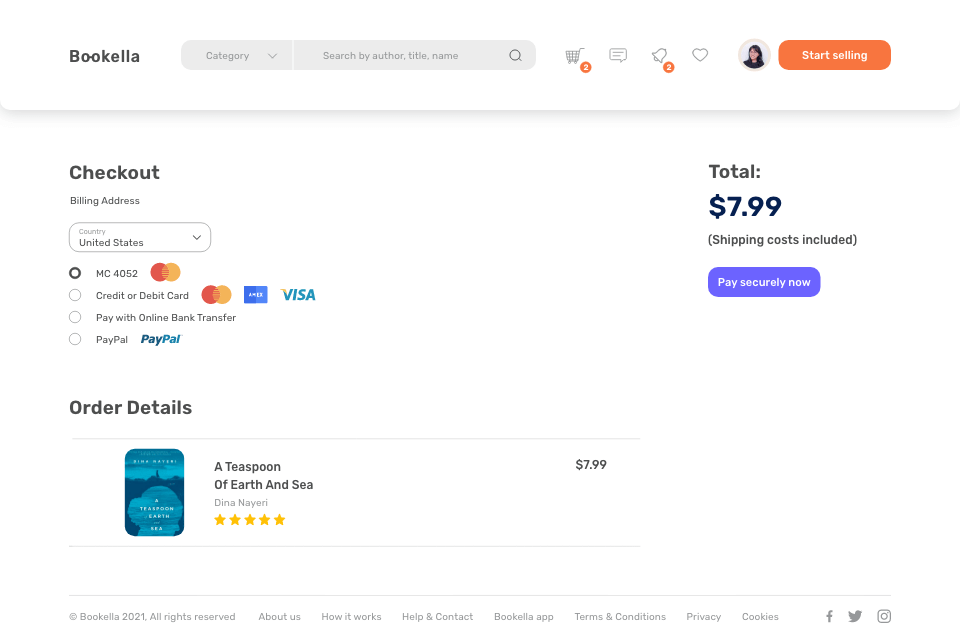
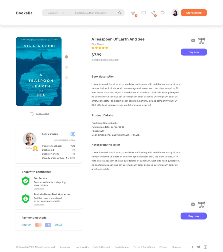
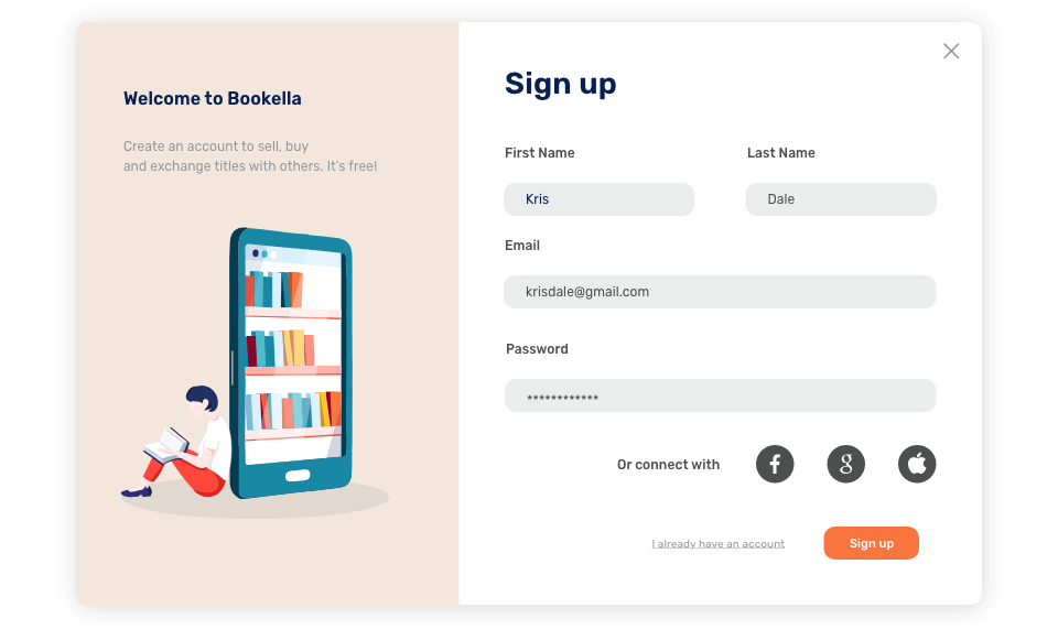
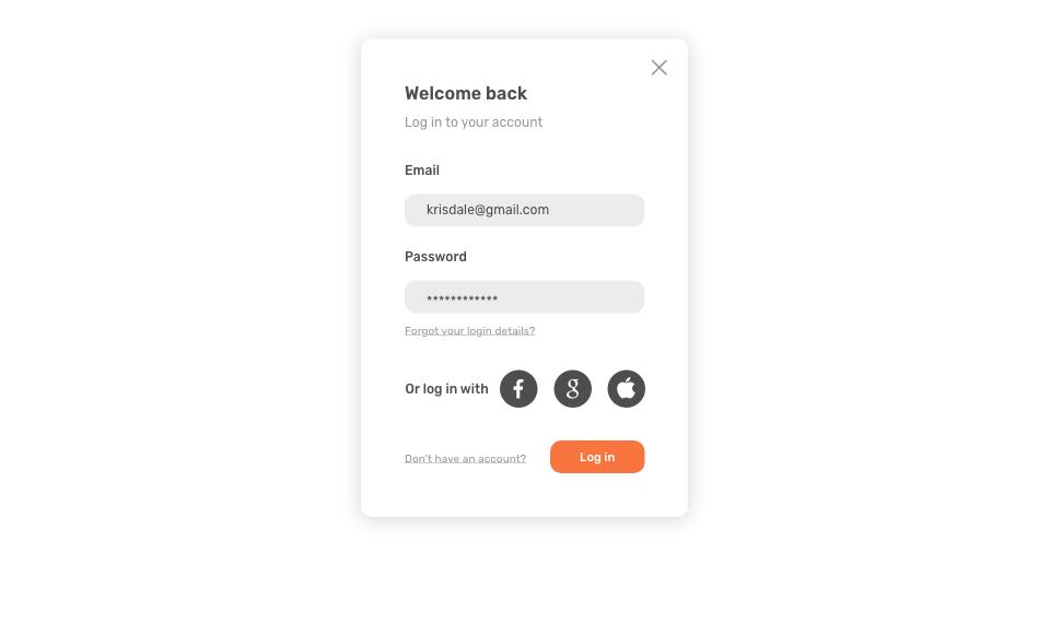
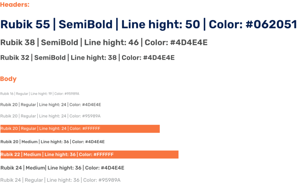
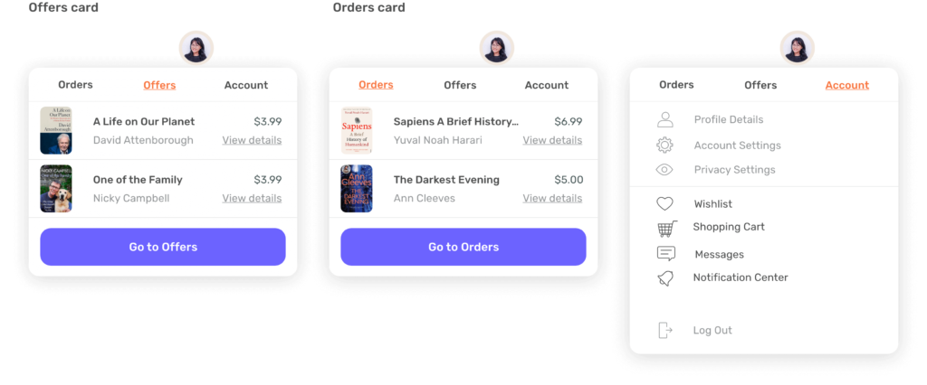
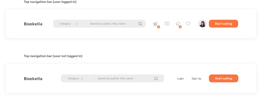
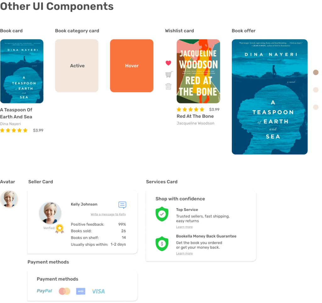
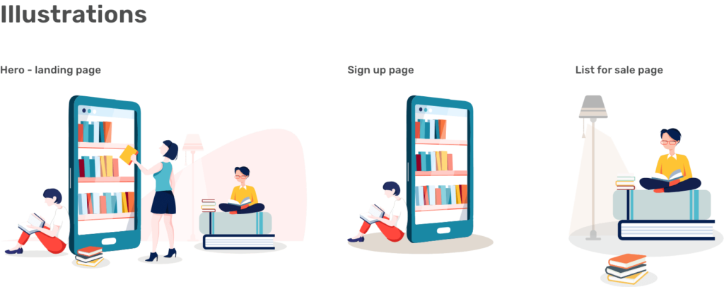
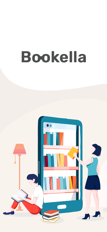
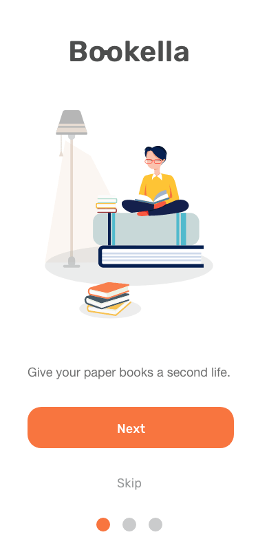
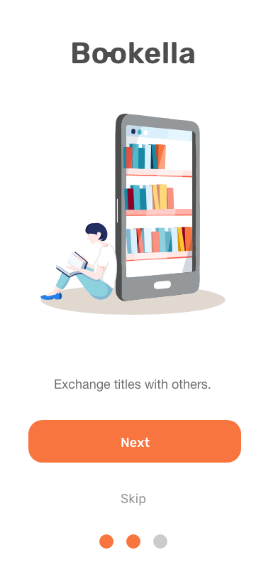
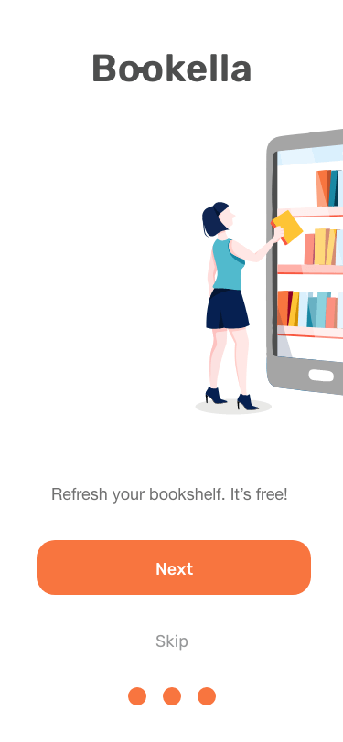
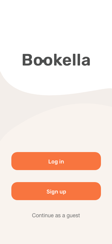
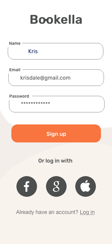
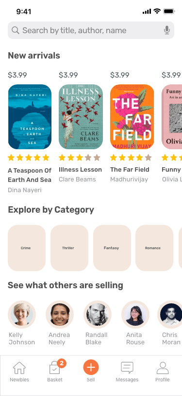
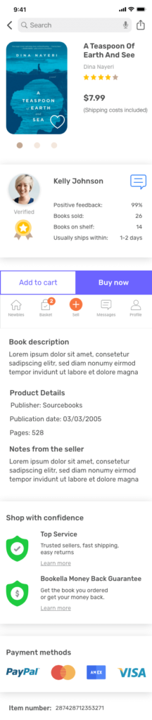
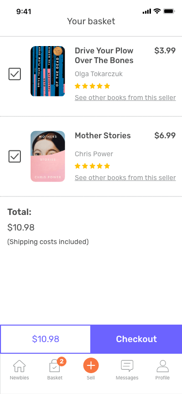
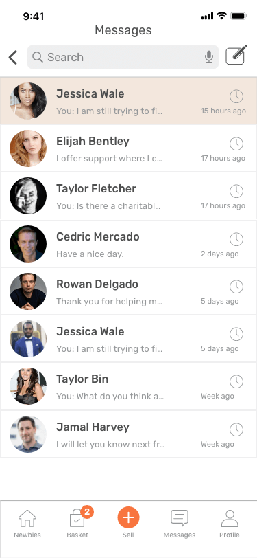
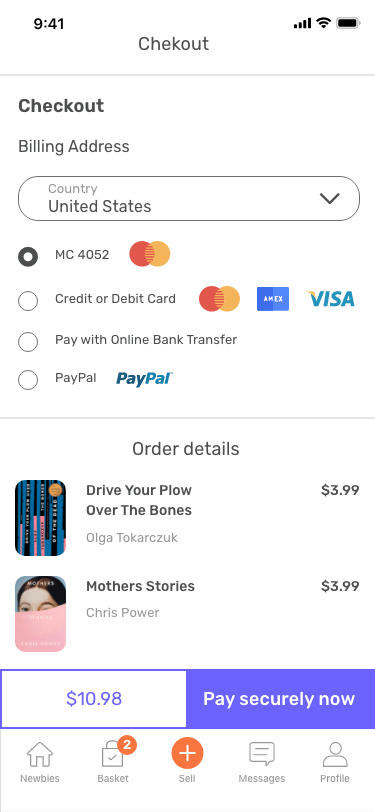
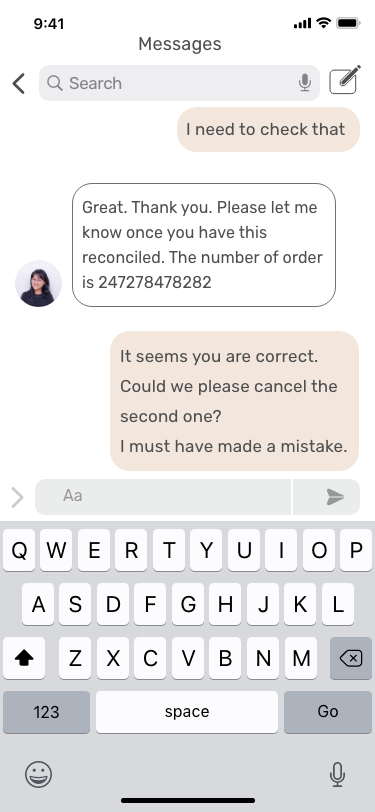
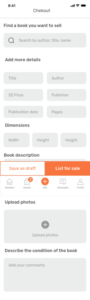
Bookella is a platform, which I designed as part of my self-development journey of becoming a UI/UX designer. I discovered the need for an app that would allow people to get paper books from others, who no longer need them as well as share their pieces for a competitive price. My goal was to design a solution that would connect the target audience and would be easy to use, efficient and attractive.

Scope

User research, user personas, user flow,
sketching & wireframing, visual design, prototyping, user testing.

Duration

February – April 2021

The Problem

Books are an essential part of our lives. Sometimes we want to keep them as a reference, sometimes because we love them. But what should we do with those we no longer need?
Or what if we bought some in affection but they turned out to be completely out of our style and we never actually read them? Well, we could give them a second life.

My Solution

To design a platform for selling books with a soul that would be open for anyone who believes books should live long or those who need more space on thier bookshelf for the titles they really enjoy. Users can sell books they don’t need anymore or hunt for unique gems themselves.

The Process

Target Audience

Anyone who wants to sell books they don’t need anymore or hunt for unique gems themselves.

Competitive Analysis

To get a better understanding of the competitor landscape, I conducted analysis of the most popular tools on the market, and found that while some of the platforms focus on thexbooks mainly, other were overloaded with many different products in addition to books. I did not find a single platform that would connect individual users and allow them to exchange books and interact with each other.

Surveys & Interviews

With the goal of understanding which features the users would find most important, and what issues they are currently facing, I surveyed 10 of my friends. I wanted to understand what would they expect from such a platform? How much time they would be able to spend there? What features do they think are “must-have”? What are the features that would make them interact with the app more often?

Key Findings & Insights

The surveys and interviews helped me understand the needs and frustrations of my users, and I was able to pull a few key findings that would help shape my project:
  • Intuitive and easy to use, only must-have features included
  • Shipping costs included in the total price of the book (no hidden costs, no calculations, only one price)
  • Personal approach – users avatars instead of just book covers
  • They want to have the feeling that they interact with people, with a platform being only the medium
  • They want to have a possibility to send a private message to quickly discuss the condition of the book, ask for a bulk transaction or propose a book exchange

The User

I thought creating user personas would help both formally define my user and better understand their expectations, motivations, and concerns.

As I continued the research, I found out the motivations were very similar among the users so I decided to develop only one persona.

Core Features

With a better idea of the user and their needs, I identified three core features that I wanted to focus on for the product.

Buy

Users will be able to buy used  books from others

Sell

Users will be able to sell books they no longer need

Interact with others

Users will be able to easily communicate with other
sellers & buyers

Site Map

First Sketches

Some of the Mid Fidelity Wireframes

Home Page – User not logged in
Messages
Book Listing
Sell – Add New Offer
Shopping Cart

How it continued

Home Page – User not logged in
Messages
Book Listing
Sell – Add New Offer
Checkout

Usability Testing

At this point, I decided to ask users for some feedback. By conducting the task-based test, I was able to improve what they found useful, and completely change what they didn’t react well to. The users were asked to complete a few tasks that would test the main features of the platform and were asked how they felt about the platform in general. Below I listed some of the key findings.

Positive

  • Users were able to complete the tasks quickly
  • Users were able to quickly find what they needed
  • Navigation proved easy for users to understand.

Negative

  • Users were confused with the category menu bar
  • Users found the checkout button to be not well visible
  • Users were not satisfied with the book listing screen
  • Users were not satisfied with the colors of the chat screen

How it ended - High Fidelity Wireframes

Based on the feedback received I made some design changes. Here are some highlights:

  • I completely refined the Book Listing page. I gave it more room to breathe and made it easier to read. 
  • I changed the color of the “Get started” button to orange so it encourages users to take action
  • I added a few explanatory icons to the Book Listing page to bring an atmosphere of safety and trust
  • On the Start Selling page, I decided to add more input fields to allow the user to add more information about the book they are selling
Home Page – User not logged in
Messages
Mini Shopping Cart / Drop-down
Shopping Cart
Profile Drop-down
Category Drop-down
Checkout
Home Page – User logged in
Book Listing
Sell – Add New Offer
Sign up
Login

Design System Language

Bookella uses orange as the primary color in order to make users feel happy and uplifted. As an energetic color, it encourages them to take action and start collaborating with other users by selling and sharing.
The usage of purple and orange aims to set the difference between obtaining a book and listing one for sale. The color selection supports readability, helps with navigation and creates a cohesive and aesthetic user experience.

Colors

Typography

Bookella uses only one typeface to give the interface a minimalistic and harmonious look.
Designed to enhance usability, readability, accessibility, and hierarchy within the app.

Iconography

Bookella uses icons that are familiar to users with the aim to assist. Unfamiliar icons are applied to catch the eye or highlight the message. They were paired with labels to avoid confusion.

UI Elements

Mobile App

Final Product

After many tests and iterations, my final product aligned with all of the objectives I had set in place – it includes the three core features necessary for users to share and obtain books, while appearing visually appealing and simple to use.

Click here to view the final prototype.

Challenges / What can be improved?

My biggest challenge was to decide on the size of elements as well as the font.  And instead of looking for inspiration from fellow developers, I could have educated myself better on UI guidelines and refer to apple and google design materials.

The only tool I used for this project was Adobe XD. While I was able to complete my full design within XD, it is useful to have a working knowledge of all of the standard tools in the industry and I plan to expand upon the programs that I use.

Let's work together

Want to discuss a project, collaborate or say hello?
Drop me a line, I’d love to hear from you! : )