Transitioning 15 teams from an outdated UI library to a modern design system with 45+ contributed components, powering apps used by 58 million users worldwide.
0+
Components in Use
0+
Core Box Products
0%
WCAG Compliance
0%
of the Fortune 500
0k
Companies using Box
0mln
Users Worldwide
About The Company
Box is a cloud-based, ai-powered content management and file-sharing platform that enables secure storage, collaboration, and workflow automation for businesses and individuals.
As of 2025, Box serves over 100,000 companies, including 68% of the Fortune 500, and supports more than 58 million users worldwide.
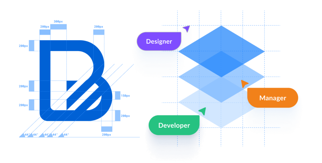
My Role
Product Designer
Team
Product Manager Design Lead Accessibility Guru 2 Product Designers 3 Developers 15 Contributing Teams
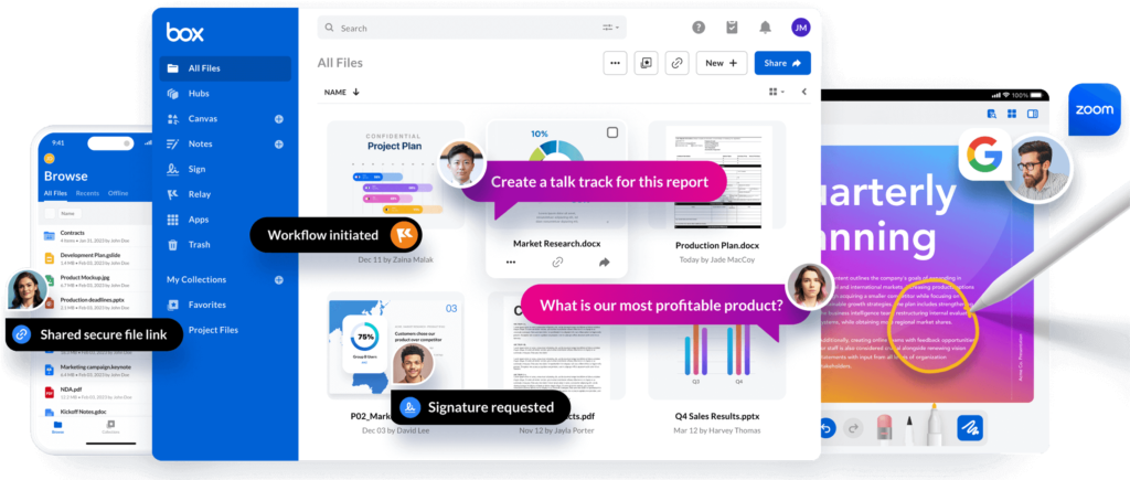
Box offers seamless collaboration through real-time co-editing, comments, and version control, making teamwork efficient and transparent.
With secure sharing and customizable permissions, teams can work with both internal and external partners.
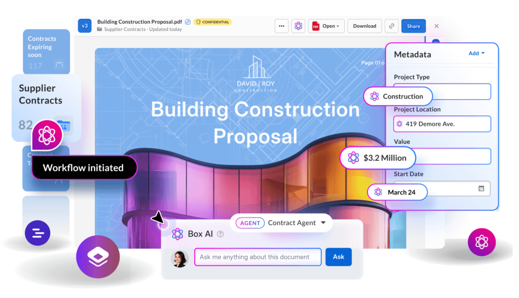
AI Studio
Box AI integrates AI capabilities into enterprise content workflows, helping teams efficiently extract insights and automate content tasks while maintaining data security and compliance.
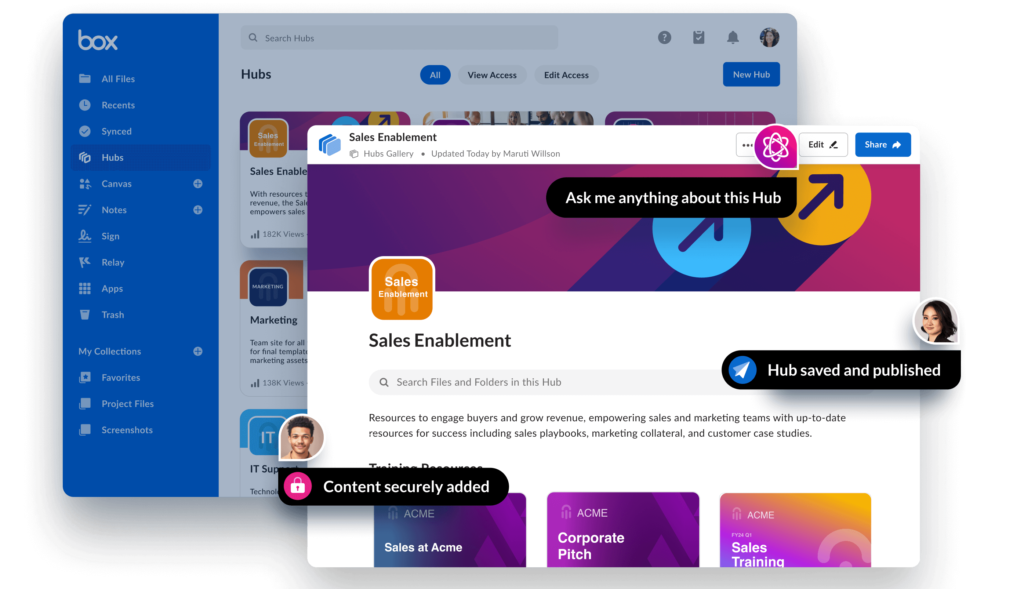
Box Hubs
Box Hubs is an AI-powered tool that lets teams curate, organize, and share important documents in one branded, searchable space, making knowledge easy to access and act on.
Box Apps
Box Apps is an intuitive, no‑code app builder that empowers teams to create tailored, intelligent workflows and dashboards.
With drag‑and‑drop customization, smart metadata management, and AI‑driven automation, it helps streamline processes like document intake, e‑signing, and file retrieval.
Our Challenge
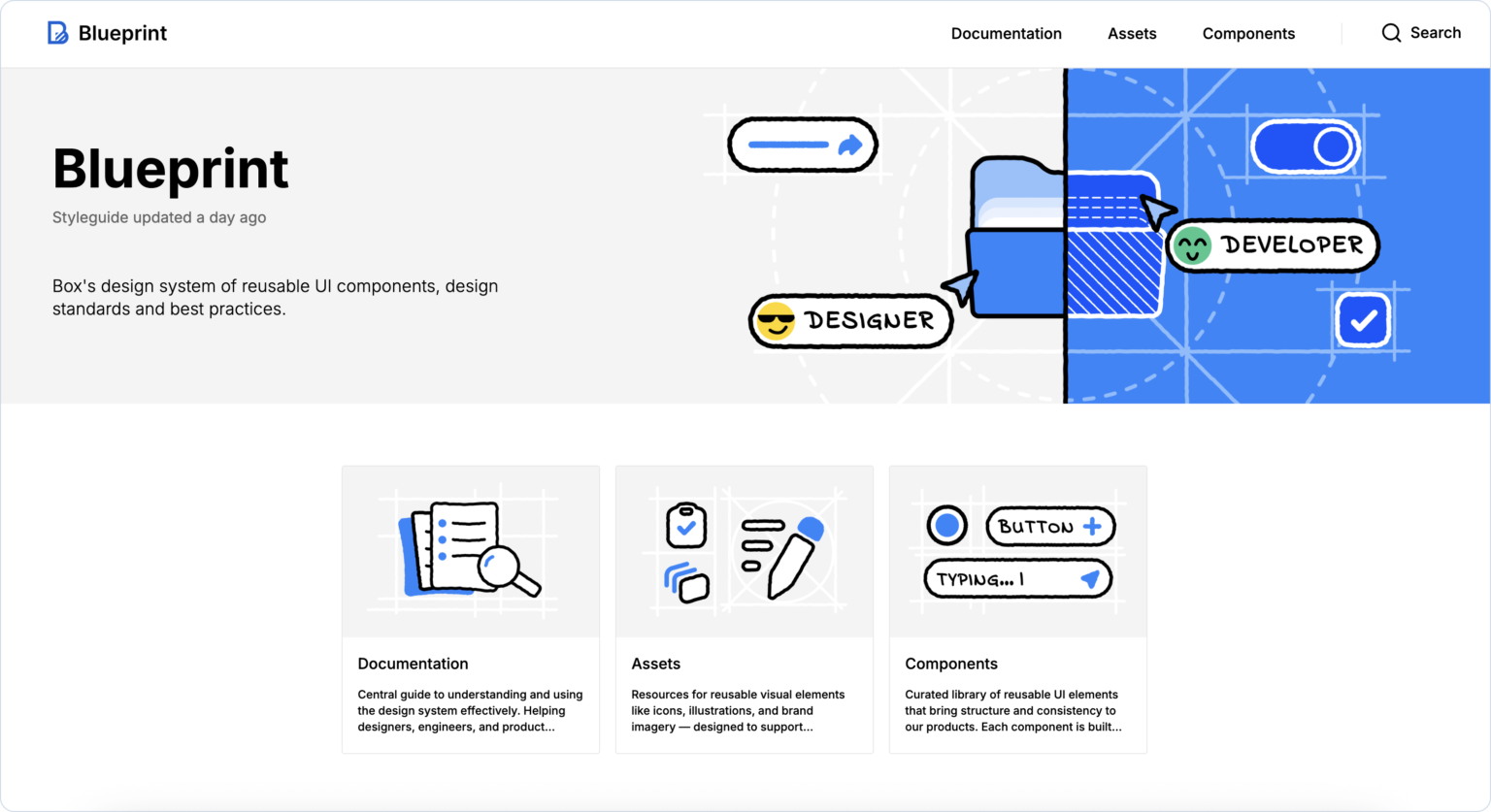
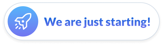
Blueprint is the new Design System in its early stage.
Before that teams were using BUIE – UI librabry, where components were often modified to achieve desired functionality. Non-existing components were built locally in silos due to complexities of contributing to BUIE. This created a negative impact on product quality causing many inconsistencies across Box Products, duplicated effort and lack of accessibility.
Our challenge was to transition teams from the old UI library to the new Design System while fostering a culture of component contribution and adoption.
Legacy ui library
Duplicated efforts
Accessibility issues
No formal ownership
Unclear standards
Lack of flexibility
How might we?
…enable teams to efficiently adopt and contribute high-quality components to the new Design System while ensuring a smooth transition from the old UI library?
The New Design System Status Quo
The development is in its early stages.
It includes the most common components for teams to use.
Contribution guidelines and quality standards have been established.
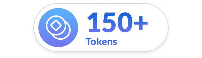
150+ tokens have been created.
Impacts 15 design teams and 29 designers.
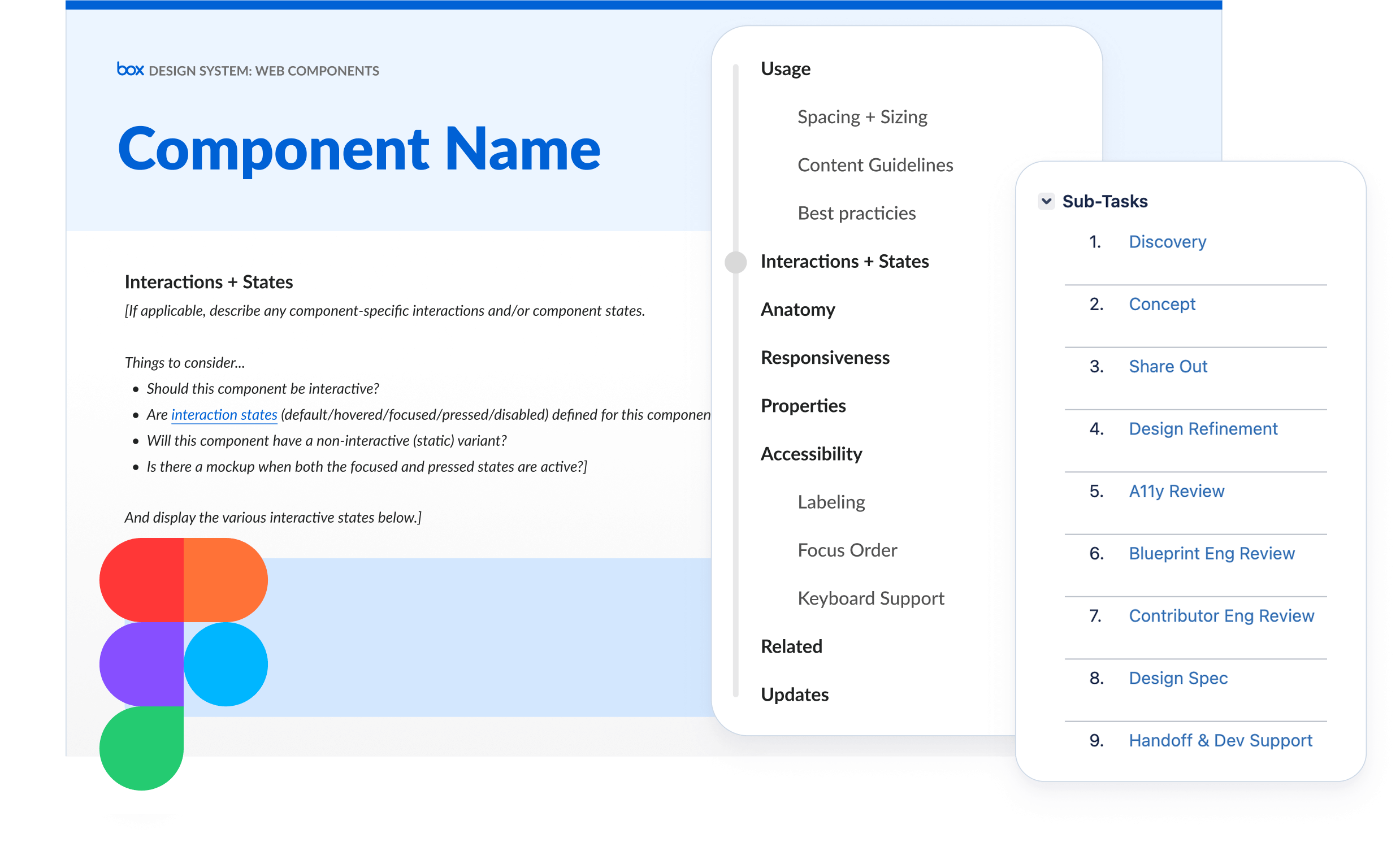
Components, Shared Features, Patterns, and documentation are stored both in Figma and Storybook.
Affects all Box products, including WebApp, Hubs, Notes, Apps, AI Studio, Admin Experiences, and more.
Our Process
1.
Enable Contribution
2.
Audit Existing Designs
3.
User Research
4.
Define Key Challenges & Goals
5.
Implement Solutions
6.
Announce Achievements!
1/6
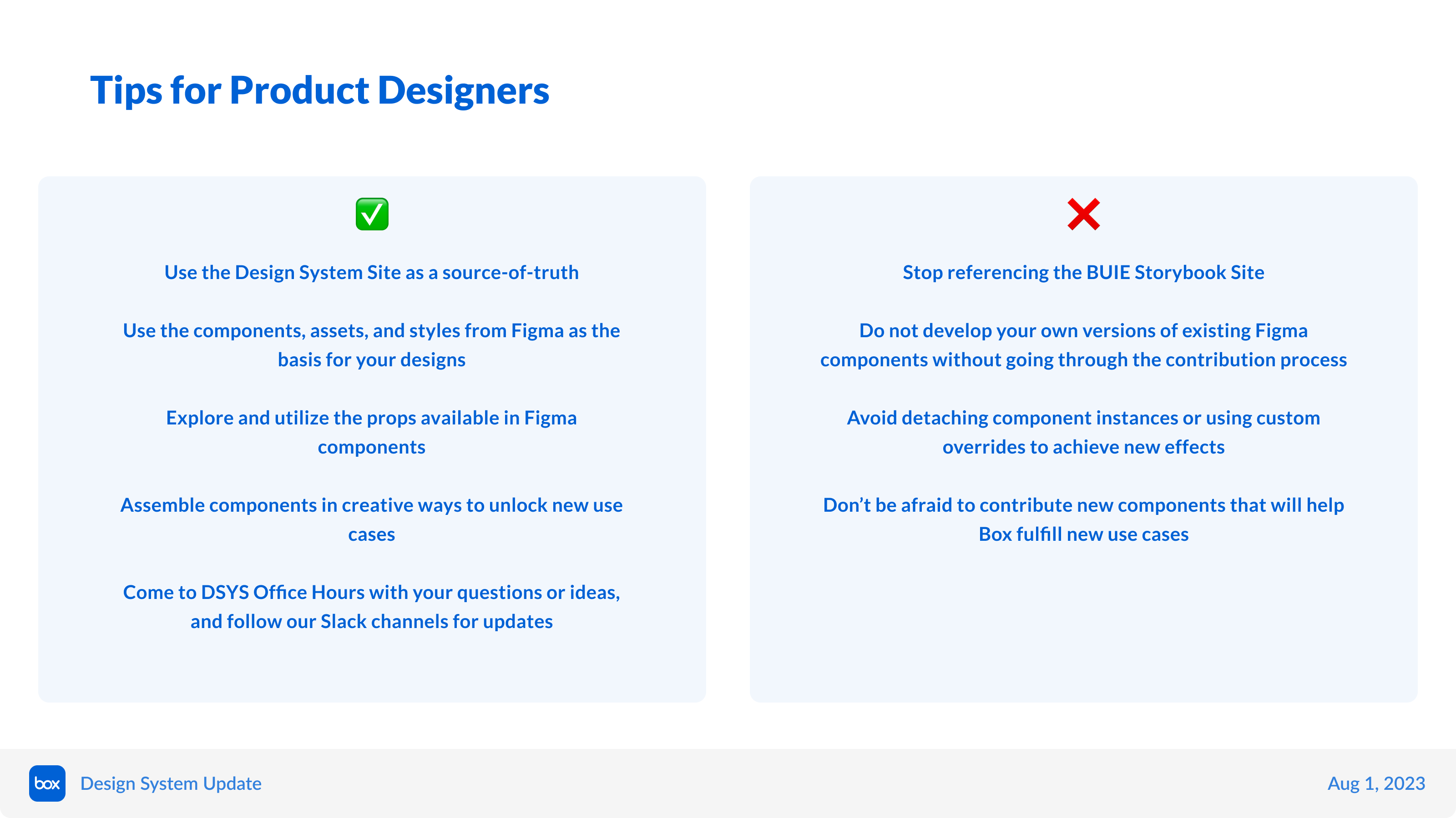
1. Enable Contribution
We created contribution guides with easy steps to follow together with the documentation templates.
We opened support channels on slack and bi-weekly office hours to provide guidance to contributing designers, and foster collaboration.
Contribution Guidelines
2/6
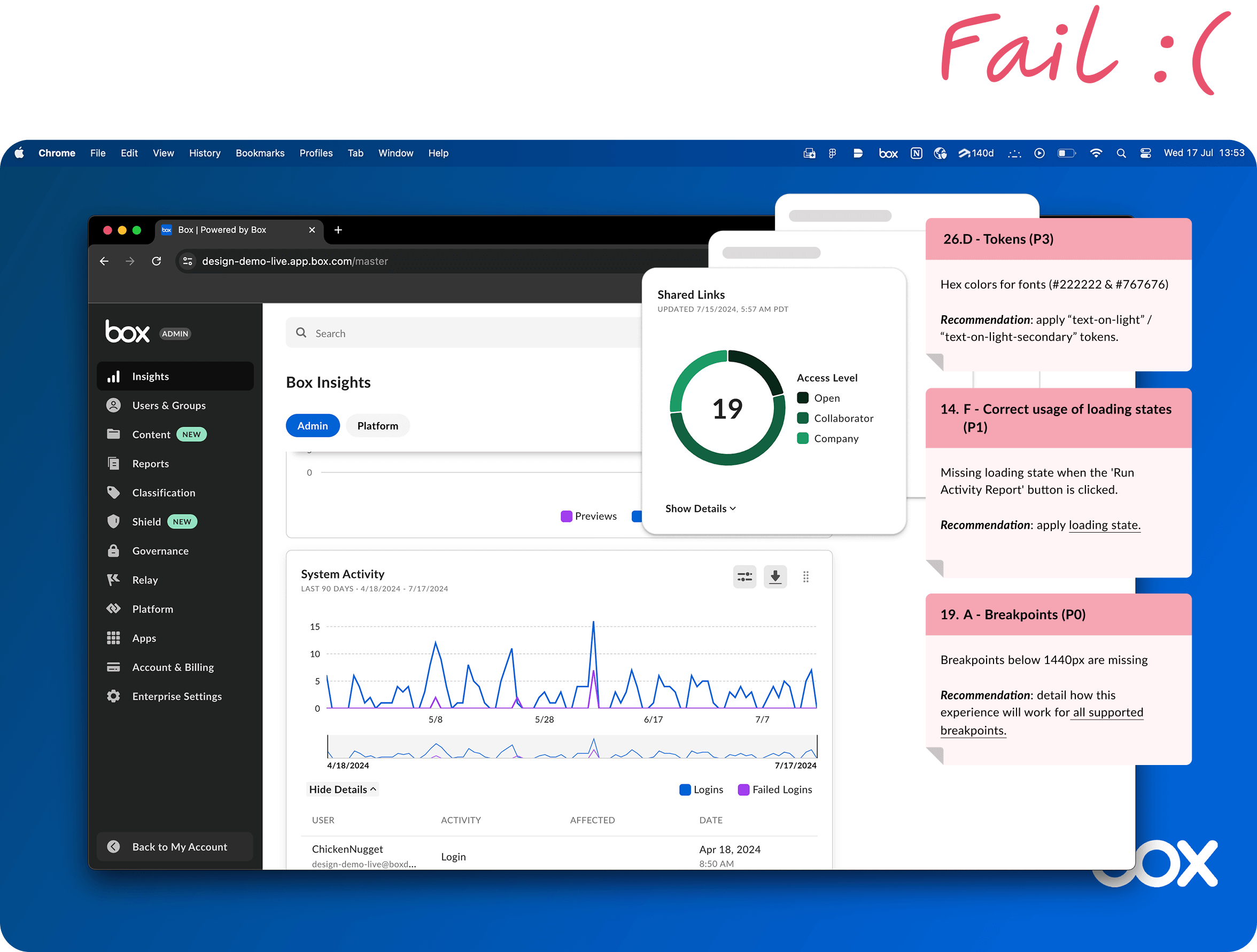
2. Audit Existing Designs
We audited existing and in-progress Box products to support teams in transitioning to Blueprint components and provide recommendations.
We were manually pointing each error with recommendations to fix them.
Manual Audit of Existing Designs
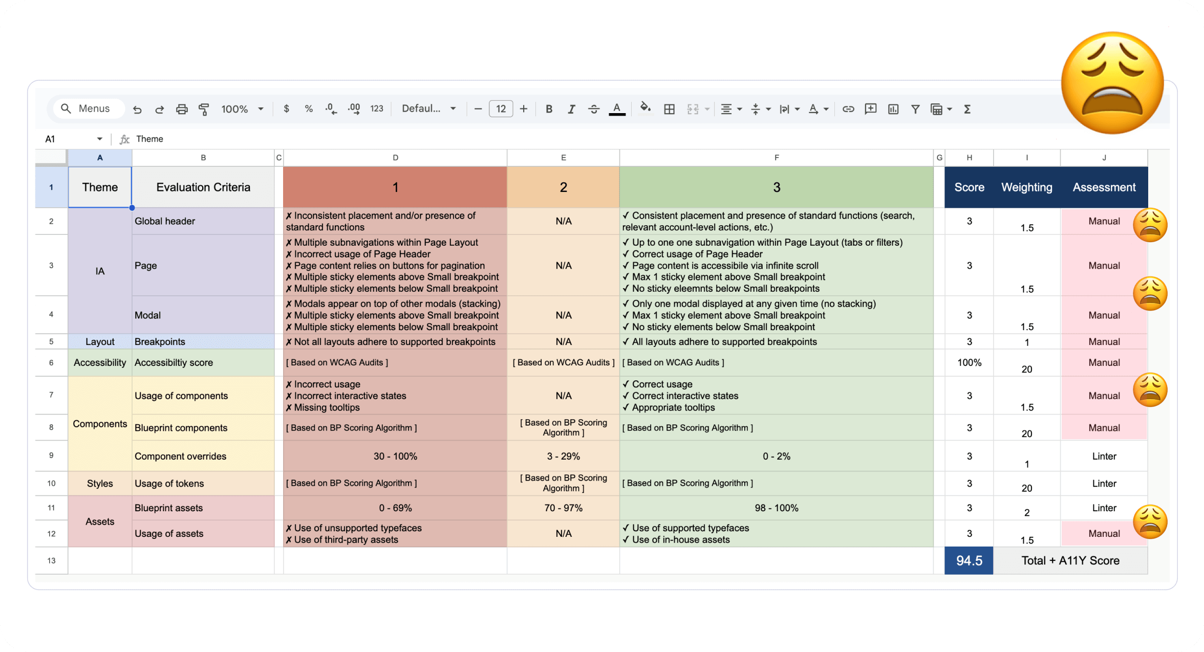
Evaluation Criteria
Later on we recognized that manual Blueprint audits were time-consuming and inefficient, making it challenging to evaluate components consistently.
We new we had to address this.
3/6
3. User Research
We conducted interviews with designers, developers, and product managers, from both contributing and consuming teams, to understand their paint points and challenges in the current workflow.
Method: Qualitative Research
Timeline: 2 months
Interviewed: 24 stakeholders
Key Stakeholders’ Goals
Product Managers
Ensure contributions align with Blueprint and product roadmaps
Coordinate cross-team efforts
Prioritise features based on Product, Blueprint, and Business needs
Product Designers
Design components
Create documentation
Test for usability and accessibility
Align contributions with product goals, and support developers in implementation
Engineers
Build scalable, accessible components
Translate design into code
Maintain code quality through reviews and contribute to technical documentation
Research Goals
Education & Contribution
Assess how easily teams learn, adopt, and contribute to the design system across management, design, and engineering.
Documentation
Evaluate the clarity and usefulness of Blueprint documentation, identifying opportunities for improvement.
Maintenance & Governance
Analyze processes for maintaining and evolving the design system, ensuring scalability and long-term sustainability.
Productivity
Measure how the design system impacts team efficiency, identifying ways to streamline workflows.
Adoption & Integration
Investigate adoption rates and how well the system integrates into existing team workflows.
Alignment with Business Goals
Ensure the design system supports broader business objectives and key performance indicators.
Key Insights
Product Managers
Optimistic that Blueprint will save time in the long run and already see saving in some areas.
Expect Blueprint to build components and frequently ask about “component roadmap”, which we don’t have as we don’t build components anymore.
PMs face minimal pressure to contribute to Blueprint.
Product Designers
Believe that Blueprint will create more cohesive and better quality product.
Love communication & feedback between Blueprint team and designers, guiding individual expertise.
Confused about the differences between Components, Shared Features, and Patterns.
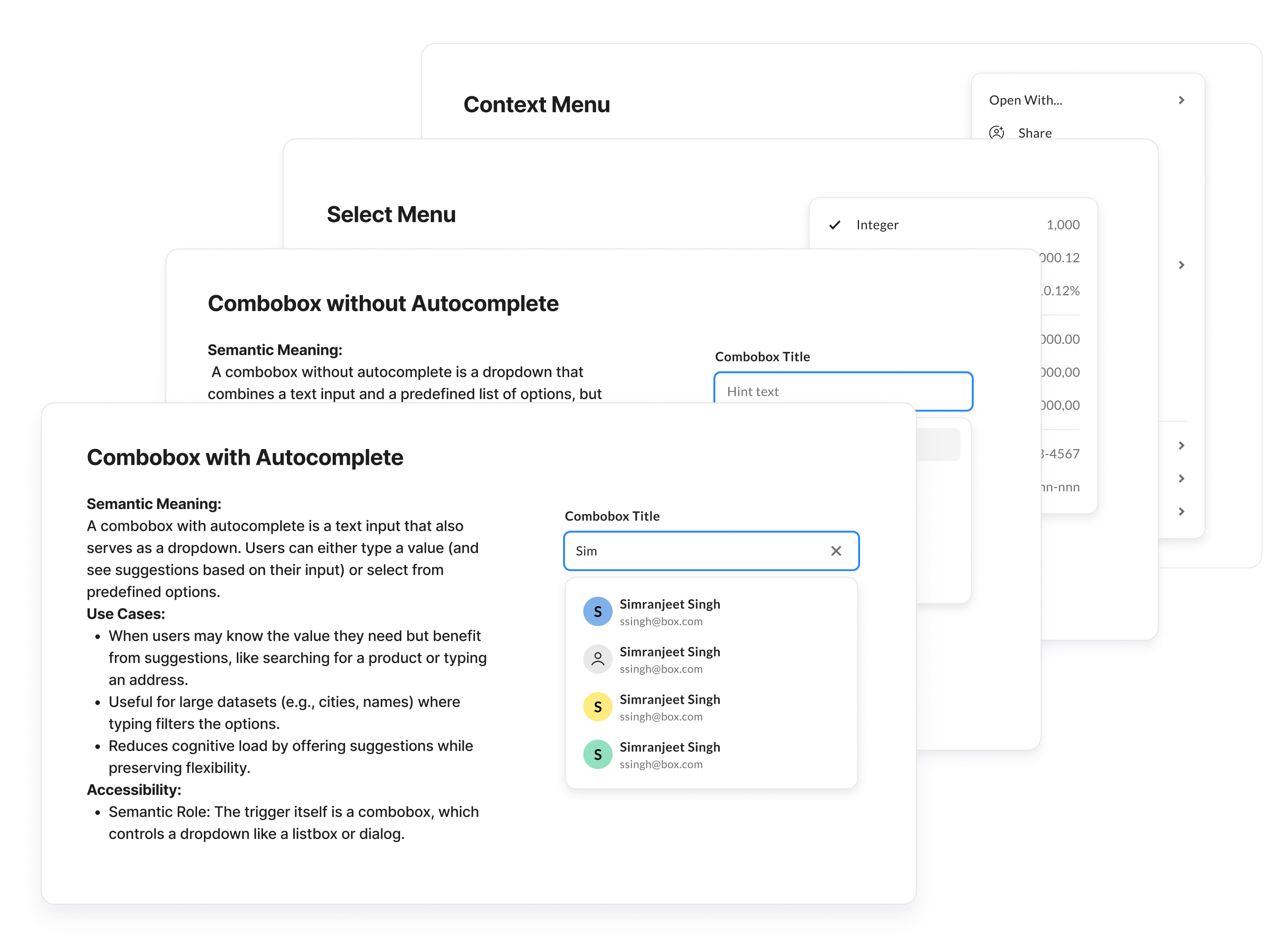
Struggled to select the right components for specific use cases, such as choosing the appropriate type of Semantic Dropdown.
Engineers
One of the best teams for collaboration at Box.
Quality of components: accessible, easily composible.
Documentation: more code examples. Real world use cases.
Shared features: no guidelines, no documentation , no clear component architecture guidance
Found it difficult to switch seamlessly between Figma and Storybook.
4/6
4. Define Key Challenges & Goals
After gathering and analyzing feedback, as well as evaluating our current workflows, we identified 4 key areas for improvement.
We then brainstormed potential solutions and decided to move forward with the following approaches.
Problem vs. Solution
Problem
Users are confused about the differences between Components, Shared Features, and Patterns.
Users struggle to select the right components for specific use cases, like choosing the appropriate type of Semantic Dropdown.
Users struggle to navigate Figma and Storybook due to inconsistencies, missing code examples, unclear architecture, and lack of real-world use cases.
Manual Blueprint audits are time-consuming and inefficient, making it difficult to evaluate components consistently.
Solution
Establish a clear component hierarchy and a Decision Tree to guide teams in navigating contributions.
Guide decision-making by developing comprehensive How-To Documentation for more complex components.
Restructure Figma and Storybook to mirror each other, fill content gaps and adopt Zeroheight as a centralised source for designers, developers, and PMs.
Develop an automated evaluation system to streamline team assessments and ensure efficiency and objectivity.
5/6
5. Implement Solutions
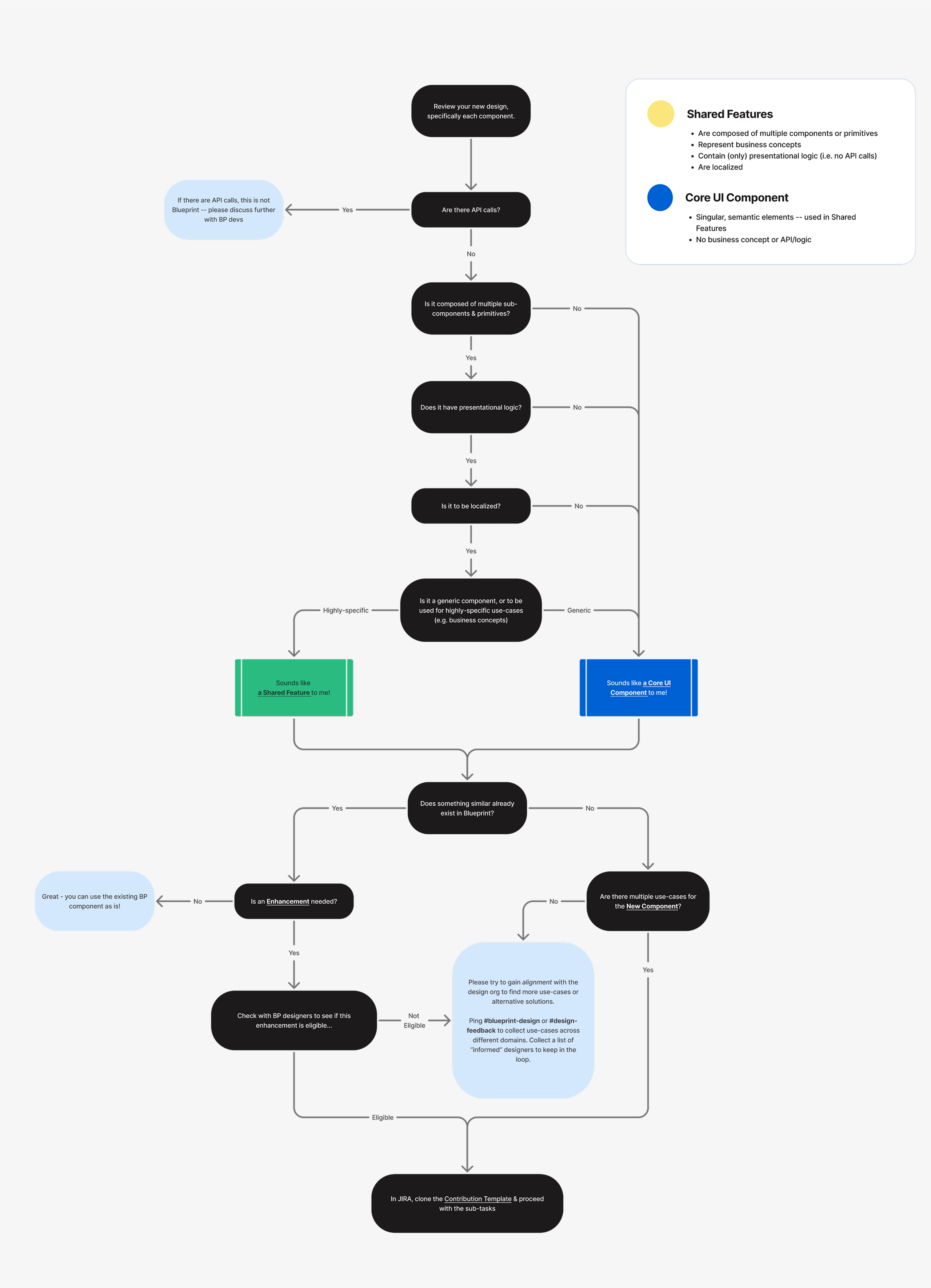
Decision Tree to Guide Contribution Process
We identified that users were struggling to differentiate between Components, Shared Features, and Patterns, leading to confusion in their workflow.
To address this, we established a clear component hierarchy and developed a Decision Tree to guide teams in understanding where and how to contribute.
This solution provided a structured framework, making it easier for teams to navigate the design system and ensure consistency across contributions.
Decision Tree
How-To Documentation
We observed that designers had difficulty selecting the right components for specific use cases.
To resolve this, we created comprehensive How-To Documentation for more complex components, providing clear guidance and decision-making support.
This documentation helped designers confidently select and implement the right components, improving efficiency and consistency across designs.
Zeroheight - Single Source of Truth
We found that users struggled to navigate Figma and Storybook due to inconsistencies, missing code examples, unclear architecture, and a lack of real-world use cases.
To address this, we restructured Figma and Storybook to mirror each other, ensuring a more seamless experience.
Additionally, we filled content gaps and adopted Zeroheight as a centralized source of truth for designers, developers, and PMs.
This improved accessibility, clarity, and alignment across teams, making it easier to find and apply design system resources.
Landing page
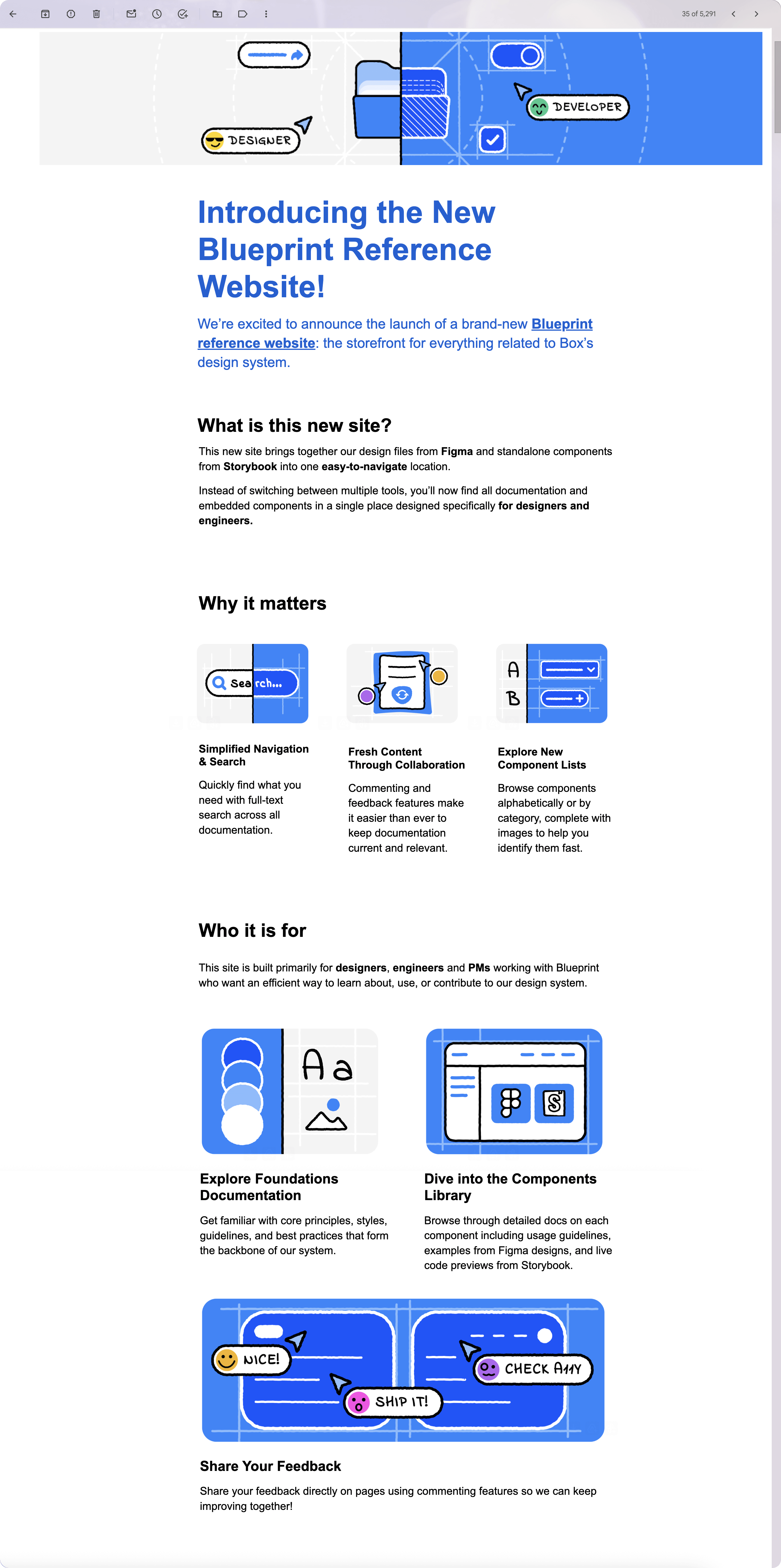
To arrive at the final structure, we explored how leading design systems organize their Zeroheight documentation.
After several iterations, we landed on a structure that met our specific needs while ensuring consistency across the layout.
We intentionally chose a playful and less rigid tone to challenge the perception that design systems are intimidating or overly serious.
Documentation example
We ran user tests and implemented minor improvements to the structure based on feedback.
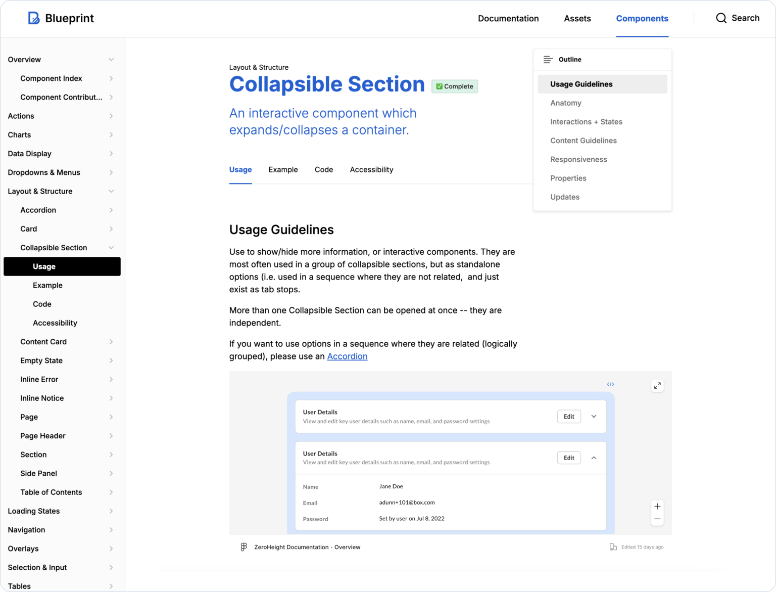
We prioritized clarity and scannability by introducing consistent section patterns (e.g. usage guidelines, anatomy, and accessibility).
6/6
Announce Achievements! 😊
Quarterly Newsletter
To keep teams informed and engaged, we send out quarterly newsletters highlighting recent updates to the design system, new components or guidelines, and helpful tips.
These newsletters are shared across all teams to ensure everyone stays aligned and aware of improvements, fostering a stronger connection between designers, engineers, and the system itself.
Impact
Adoption & Collaboration
2,912 components in use – a 300% growth since January last year.
Partnered with 15 teams to deliver impactful projects, fostering innovation and cross-team collaboration.
23 shared features adopted across core Box products, including WebApp, Hubs, Notes, AI Studio, and Admin Experiences.
0%
Growth
Components
45 components built and actively used.
65,000+ Figma component inserts in design files (verify with Chuck).
0k
Component inserts
Accessibility
Achieved 100% WCAG compliance for all components, ensuring a more inclusive and accessible experience.
0%
WCAG Compliance
Team Efficiency
Bluerpint played a crucial role in the successful and timely GA of key Box products, including Hubs, Apps, and AI Studio.
Example: The initial timeline for Box AI was 3 months and by leveraging pre-built components from the Design System, the work was completed in just one sprint.
Identified that manual Blueprint audits were inefficient and inconsistent.
Introduced an automated evaluation system to streamline assessments and help teams measure their compliance with the latest Blueprint Standards.
0%
Automated BP Audits
Learnings
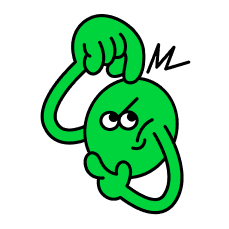
Working on a Design System is both challenging and rewarding. At one point, I felt stuck and asked my manager for time to explore how other companies approach similar challenges. Driven by the belief that a better way must exist, I dove into benchmarking and research, eventually attending the Into Design Systems conference in search of answers. What I found was reassuring: there’s no one-size-fits-all solution. Every team faces unique constraints. This experience taught me that flexibility and adaptability are key. It reminded me that progress doesn’t come from having all the answers upfront, but through continuous learning, collaboration, and refining the process along the way.
Thank you for viewing!
Let's work together
Want to discuss a project, collaborate or say hello? Drop me a line, I’d love to hear from you! : )


